Tuesday, 31 January 2012

Unit 4: Story-Telling - My Ingredients

To start the semester off we have a new project which is Story-Telling. We have now been briefed and giving our ingredients to create an original storyboard through an animatic and a pri-vis animation which will last around one minute.

The ingredients we were giving for this project are an Environment, a Prop and a Character. The ones that I got were:
-         Environment:                Farmyard

-         Prop:                               Wheelbarrow

-         Character:                      Superhero

Smallville Much? /:(

I am pleased with the ones I have got for this project but at this time I can only think about is Superman from Smallville because he is a superhero and was brought up within a farm. I have started to get some ideas need to get them down on paper to start of this new crazy journey within a new project.
 

Thursday, 19 January 2012

Unit 3: Enviroment Presentation

Unit 3 - Enviroment Presentation

Unit 3: 'The Uncanny' Written Assignment

Unit 3: Uncanny Written Assignment

Unit 3: Creative Partner Archive

Blog Comments:
8th Decemeber 2011
-          Jamie Tibbott (Comment to Me): Nick! get some more stuff up on your blog!!! i want to see some ideas :(... please? :D”
11th December 2011
-          Anita Gill (Comment to Me): “Hey Nick, your Photoshop and Maya work looks good. what kind of ideas have you got for your project? I found the list of websites and artists on the brief really helpful. I'm not sure if you've had a look at them yet or not :)”
12th December 2011
-          Me (My Comment to Anita): “You are showing everyone up with those texturing skills off yours lol loving the frame work if you had like a victorian house or maybe that sort of frame in a modern house living room that would be odd and take the audiences attention straight to it, good idea for a thumbnail unless you already have something like that lol :) btw i will have work up soon for you and Jamie to assess, sorry for taking so long about it”

9th January 2012

-          Anita Gill (Comment to Me): “I like the wallpapers you've chosen nick. you should also research carpet designs like the one we saw in The Shining. The clashing colours and patterns would work well.”
15th January 2012
-          Jamie Tibbott (Comment to Me): “nick! i like the floor angle, id keep playing around with that but if you get your texturing and such in then it should become more clear to you buddy :D”

-          Me (My Response): “Your right I need to get the texturing in first before i can decide truely. Thanks for the input :)”

19th January 2012
-          Anita Gill (Comment to Me): “your latest combination of wallpaper and carpet is more successful compared to the choice of the blue wallpaper and brown carpet. The camera angle also works really well”

-          Anita Gill (Comment to Me): “well done nick, it's looking really good!” (Response to my Final Piece Progession)

Work Sessions & Talks:
Throughout the last two weeks of Unit 3 me, Anita and Jamie have been meeting up in the DM rooms and base room quite a lot to help each other and talk about each other’s work to help with our creative partnership. I have helped them with decisions on what helps and goes best with what scene they have done vice versa. We have also helped one another out with Maya problems as we are all at different levels of knowledge with Maya so they have been a great help to me and I have learnt a lot, best partnership I had so far and I hope I have helped them as much as they have helped me.
P.S. There was a problem gaining some of my comments that I sent on Jamie’s blog, everytime I loaded up the page with my comments on it froze and I couldn’t work around it, so there are some comments missing.


Unit 3: Tableau Vivant-Style Scene

Here is the final Tableau Vivant-Style Scene that I have created using Autodesk Maya to model, texture, render etc. I have also used Adobe Photoshop to finalize and add another light effect to give it a bit more depth which you can notice at the front bottom right corner. I am very proud of this work as my first time using Maya for a project independently. Hope you like it : )

Unit 3: Digital Set Pipeline Production

This here is the digital pipeline production where I have made screen shots and render shots to show the progress of the pipeline. The screens go down in this order starting from the top to bottom, the order goes; ‘Wire Frame’, ‘Shaded Wire Frame’, ‘Untextured Model’, ‘UV Texture Maps’, ‘Textured Model’, ‘Ambient Occlusion’ and the ‘Z Depth’ (The last screen shots are the Rendering Passes).


I didn’t use the Z Depth in the end within my scene only because how small the scene is in comparison to the effect it gives off, it would make my scene to blurry, I did mess around with the settings but overall I didn’t like the outcome so I left it out but still did a screenshot of giving it a go.


Unit 3: Matte Painting

The matte painting for my tableau vivant style scene is an interior for the elevator at the end of my hallway. I used a red airbrush to create and different tones of red to make a soft interior for the walls of the elevator, I then created a gold bar for the elevator to give it more of a realistic feel and then added shadow and light on the bar to gain effect from the area light that I have used inside the elevator within Maya.


Wednesday, 18 January 2012

Unit 3: Final Piece Progression

I started this day off by carrying on with the modelling stages for my uncanny scene by creating the elevator doors as well as the elevator shell. The inside of the shell will be where my Matte Painting will be placed. I have also changed the texture for the wallpaper, the other one I had did not work well, the new texture I have found has worked well and suits the scene and gives it a more eerie atmosphere.


The next thing I did was start the texture for the metal on the elevator doors I wanted to go with a red blinn and have it giving off a shine when the light hits it later on when I put the lighting in. I also but a metal bump on it as well it is a bit big and I need to adjust this on the UV texture editor as well as the tile on Photoshop to sort this later on.


After that I then moved onto the lighting as well as modelling the wall mounted lamp shades, I made the lamp shades with half a cone, adding a gold blinn around the rim and then adding a glow intensity as well as dropping the transparency down to make the model see through slightly to give the effect of the light bulb shining through the glass lamp shade.


I then used a spot light inside each of the mounted lamp shades pointing upwards to the ceiling to get a dim light around the scene with the highest light source from the ceiling bouncing towards the floor. I also modelled and used a blinn for the bin with the ashtray on top and created an area light for the elevator to get a stronger light source from within the elevator fading out onto the floor.


Unit 3: Final Scene Concept Piece

For the build-up to my uncanny final scene I needed to design a concept piece for this unit. I have decided to do a hallway scene with a major influence from the film ‘The Shining’. Here are my work up drafts as well as my final concept piece.


Monday, 16 January 2012

Unit 3: Independent Maya Session

Today I carried on with the modelling my scene using Maya I finalized the doors (without using a UV Map instead I used a Planer map, it was intentional it just happened and the doors actually came out ok after the rendering stage). I then added text which is something I haven’t done before with Maya, had some help from a very stressful second year, very kind of her and I thank her again : ) I used a gold blinn to make the hallway doors seem more hotel like.


I did put in the texture of the carpet and wallpaper in first before actually UV editing the plains which was silly and I have corrected, because they seemed stretched which didn’t look good. The carpet does seem to go well with a repetition of patterns which would drive any sane person insane, weren’t to sure on the wallpaper though, too much of a clash, going to try a blood red base with black patterns next time.


Today has been very productive and I got a lot done in Maya then I expected today, with the deadline closing I do feel the doubt of not being able to complete it in time for the presentation, but I’m hopeful and keeping motivated :D shame my Maya at home doesn’t think the same.

Sunday, 15 January 2012

Unit 3: Maya Session 4.0

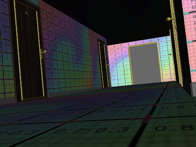
Within this session of Maya I started my modelling stages for my uncanny scene of the hotel hallway. I started by modelling the hallway scene using plains for the walls, floor and ceiling. I then added my pre-vis camera in to adjust it to the perspective that I believe would be most fitting for to gain and uneasy feel from the scene.


After sorting out the basics of the hallway scene, I then started the Door designs I made two different designs just in case I wanted to add the other model in to not have it so symmetrical. The doors seemed easy to model but of course going alone on Maya is quite daunting but anything is possible with the right mind set.

  Door Design 1: Draft 1

  Door Design 1: Draft 2

Door Design 1: Draft 3

Door Design 2: Draft 1

Once I got the basics of the doors done I then moved onto the door knob designs doing a basic ball joint door knob is the type that I want for my scene, it has come along fine just need to change the colour of it, brown doesn’t really go well and add some reflective effects on it from the lighting which will be in the scene later on throughout the designs.


Unit 3: Hallway Scene 1 or 2

Here are two shots of the hallway scene which I am not too sure on, so any input on what scene looks better or gives more of an impact, please leave a comment

  Hallway Scene 1

Hallway Scene 2

Unit 3: Maya Session 3.0

Within this session of Maya it was the day before we split up for the Christmas holidays so to end the term with some Maya knowledge we started the tutorials on how to attach fur to models as well as finish of the lesson by modelling and attaching fur to Santa’s hat.

First off all I needed to know how to attach the fur onto a model, so I created a plain and clicked onto the Fur option within the top bar, once I pressed that a new set of tools and options showed up on the right and an option was created within the Outliner so I then went through the pre-sets on what fur there was available within the tutorial it started with Polar Fur so I did the same.


After adjusting the settings of the first default render I then added in some shadow to give it more of an impact for the final render.
I then started to move onto different effects that you can do with attaching fur to models by blending fur pre-sets (polar and bison) adding multiple fur pre-sets to one another using per cents to adjust the level of which pre-set is most dominant and finally lighting and shading stages.
  Blending Pre-sets

 Multiple Pre-sets

Lighting and Shading Stages

Thursday, 5 January 2012

Unit 3: Door Knobs, Doors & Wallpaper Patterns

This here is some more in depth research about the designs of the door knobs, doors and Wallpaper textures to get a better understanding to be able to see what I’m modelling around and not just thinking of the top of my head and using these images within these influences maps to help.

These are images of different angles and designs of door knobs and doors to get an all-round perspective off how it looks. The way I’m thinking on how to go about design the textures to the door knobs is possibly a blinn and give it a reflection but of course need to trial and error with Maya.


Here are some wallpaper patterns that I have found which I really liked and feel will have a great impact for my uncanny scene of my hallway scene.