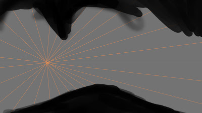
The first print screen is showing what the perspective lines look like and you can work around them, you don’t have to but it helps and with this it can help make a more dramatic and cinematic concept piece.
Here are the other drafts that I print screened of my work within this session on how I started to build it up, firstly by doing it as a silhouette, and then adding colour to block out certain points.


No comments:
Post a Comment