Here are some of the thumbnails that I have done throughout my sketchbook and idea progress after I finished my research sketching sketches of different metamorphosis’s with the human and animal I have been spliced with.
Here are the first 9 thumbnails that I have done within my sketchbook I choose one out of the first 9 to progress with and see what the outcome of it will be.
I picked number 3 and worked on with that doing an external and internal sketch of my head and the fishes head to get an idea of what features to keep off mine and what to merge with the fishes.
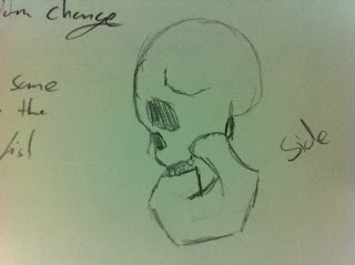
After I constructed design of a quick skull sketch I then went on to see what it would look like on the shoulders of thumbnail 3 to see what it would look like and to see if it would work well.
I then started to work on how the arms would look like for this hybrid, I wanted to keep the firefishes attributes in there, with its fin, its pectoral fins and fellers in there as well so I started to do a few designs of the change of what would happen.
This one is my favourite out of the arm transformations
Out of the four stages of the arm transformation I prefer the third stage to the forth one, only because I really pushed myself to it and went eccentric on more than just the hand itself and did the elbow and split the bones apart so webbing could go in between the gap.
I then wanted to do a quick detailed sketch of how I wanted it to sort off look like using the skull designs and arm transformations (sadly I apologize for not having the whole figure up yet I ran out of room on the paper there will be a full sized one soon).
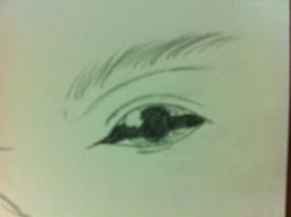
Once I did my sketch of thumbnail 3, I thought to myself how am I going to design the eye? Should I merge it with mine and have a hybrid eye? Or shall I just choose the fish’s eye or the humans? I was a bit stumped at this point because I wasn’t so sure on which one to do, but I have done a quick sketch of what a first draft of it could look like.


Hey Nick, I think you should consider taking your pencil sketches into Photoshop, converting to greyscale via 'mode' and using levels to take the fuzz and yellowing out of your thumbnails. Your drawings are looking less effective than they actually are on here, and it just gives your blog an appearance that is a bit, well - a bit depressing for the viewer. It only takes a couple of secs to polish before publishing - for instance - cropping your images so they look less amateurish. You've got some nice thumbnails here (I like number 7 too!), but you're obscuring their qualities with poor presentation.
ReplyDelete