
Wednesday, 14 December 2011

Unit 3: Photoshop Session 2.0
Within this Photoshop session we moved onto creating frames and signs using the texturing skills we learnt from last week’s session. Unfortunately I have lost one out of the two frames that I designed, the file got corrupted. The good news out of this though is that I still have one to show and understand the process of how to do it.

Here is my design of the first frame that I created, it may seem a little rushed but I just wanted to get a general idea before I moved onto a much more detailed sign/frame.

Unit 3: Maya Session 2.0
Within this session I carried on with the treasure cheat model, texturing it still. The first step I took was to carry on with the texturing of the coins. I finished the designs within Photoshop in the last session so in this one I created the blinn I needed to it as well as the other get the shine on the coins before I added the designs on.


Here is the rendered view of what the coins looked like

After that I then started the texturing for the goblet which was very simple to do because all I had to do was the same texturing which I used for the coins, all I had to do was delete the designs and keep the blinn and lambert. Here is what the Hypershade view looked like as well as the rendered view underneath that.


I then moved onto the map designs which did take a while, firstly take the UV layout by doing a snapshot then taking it onto Photoshop to then design a map making it look a little burnt and dried out because of the sun and sand. After that then bring it back onto Maya to then create the texturing for it.

Here is the rendered view of the map.

The gems where quite easy to do because within the tutorial it showed you how to create the right colour shade for the blinns within Hypershade and then all you had to do was use the same texturing but just change the colour to blue, red and green.

The barrel was probably the most tedious one out of the lot because I had to take the UV, create the design for it on Photoshop, bring it back onto Maya and then do it all again for the rim of the barrel to give it a more realistic effect, same process as the other steps it just took longer that’s all, still needs work to it, need to add the rust to the metal of the barrel which will be done within the next session or free time.


Unit 3: Thumbnails: 01-21
Here are the first lot of my thumbnails that I have sketched to try and build an uncanny scene using 4 out of the 5 ideas I had. The thumbnails are based around Hallways, Abandoned roads, Childs Room and Roadwork’s. The research of the Shining and Sven Fennema has helped bring out some thumbnails which I feel are stronger than others but I am only halfway through them at the moment so more need to be done before I settle on a thumbnail that I want to carry on with.


Here are the thumbnails 01-21. The first bunch of thumbnails 01-06 are based on a Childs Bedroom.

07-12 are based around Hallways

13-18 are based around Abandoned Streets
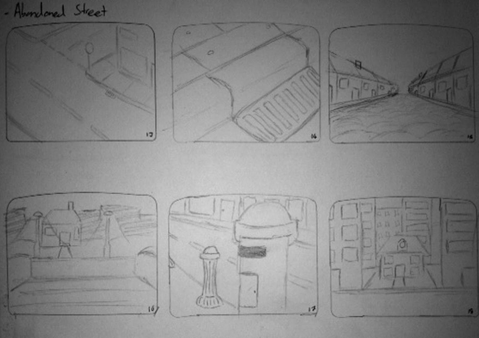
19-21 are based around Roadwork’s on a Motorway/Highway

The theme for all these thumbnails are to have a kind of uneasy, unfamiliar and nervous feel to them to give them a spooky atmosphere about them all.
Unit 3: Artist Research - Sven Fennema
While continuing my research I came across a photographer called Sven Fennema whose work is around ‘lost buildings’ for example abandoned houses, hospitals, prisons etc. Her work has a feeling to it which gives me a chill as in I do not want to be in this place for its hidden mystery’s and odd presence about these places which I really like and feel influenced by her work. I feel like this is a good source of research that I found to help push me in a good direction for my tableau vivant-style scene.
Here are some photos of her work that I felt had the most relevance to my work.


Stairway
Tuesday, 13 December 2011
Unit 3: Further Research - The Shining Set Design
While researching I came across The Shining, I have seen it before and I thought and how it made me feel so unwelcomed and strangely nervous by its empty long narrow hallway’s, the silence throughout the entire hotel really freaked me out.

Danny playing in the Large Hallway


Stanley Kubrick was the director and one of the main producers of the Film adaptation and how he has envisioned the hotels interior to build so much tension by their vast corridors and ceilings that seem to go on forever, as it looks like it is overwhelming the cast. This to me gives the right sort of feel that I would like throughout my work to build up my scene.


Lifeless Corridor
With this last film still I liked the angle that it gives with the atmosphere already filled with tension this gives the fear of what could be in that room ‘237’ and if you have already seen that film the janitor tells Danny not to go in there, evil room, long story short, and only knowing that about the room it makes it even worse that you want to know what’s in there but really don’t want to know.

Room: 237
Monday, 12 December 2011
Unit 3: Film and Visual Influence Maps
Here are three influence maps that I have filled with images and film stills of scenes that will help with my initial ideas of the child’s bedroom, the motorway, the hallway of a house/hospital and an abandoned street which I want to go for a nightmare/horror approach to give the idea of fear and there’s something not right about the environment to make the audience aware of unfamiliar situation within the scene.


The film stills that influence me are from 28 Days Later, Coraline and Paranormal Activity 1 and 2, by how there scenes give of abnormal and uneasy feelings to the audience, how each scene is uncanny by Coralines real bedroom scene (Middle image on the right) is dark gloomy and gives the audience a idea of a boring plain room, were as her other bedroom is filled with what she desires giving the feeling of a much brighter and unfamiliar bedroom by how its compared to her main bedroom.

Subscribe to:
Posts (Atom)